

The “Style” section lets you style your testimonials widgets.
Card
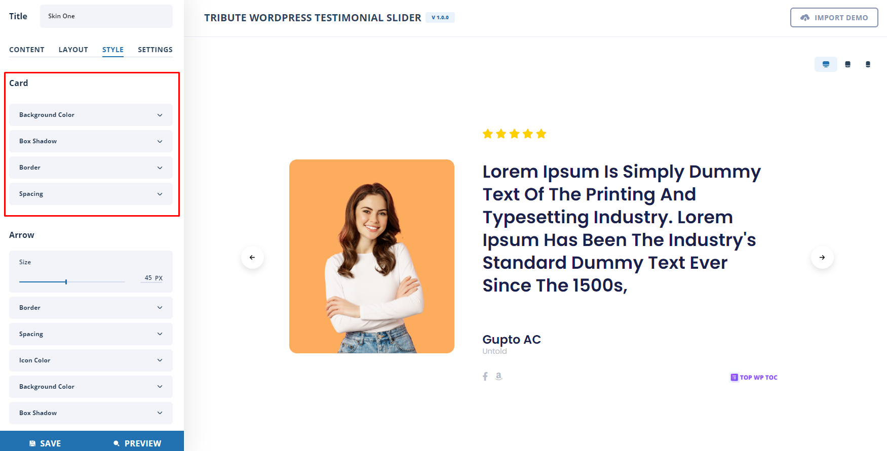
It contains the following elements: Background Color, Box Shadow, Border, and Spacing. Changing your card’s color, adding shadows, or setting the hover color is possible from here.
Background Color
Cards can be customized with a different background color
Box Shadow
Adds shadow to the card
Border
Creates a border around the card
Spacing
If necessary, define the spacing on the card
Arrow
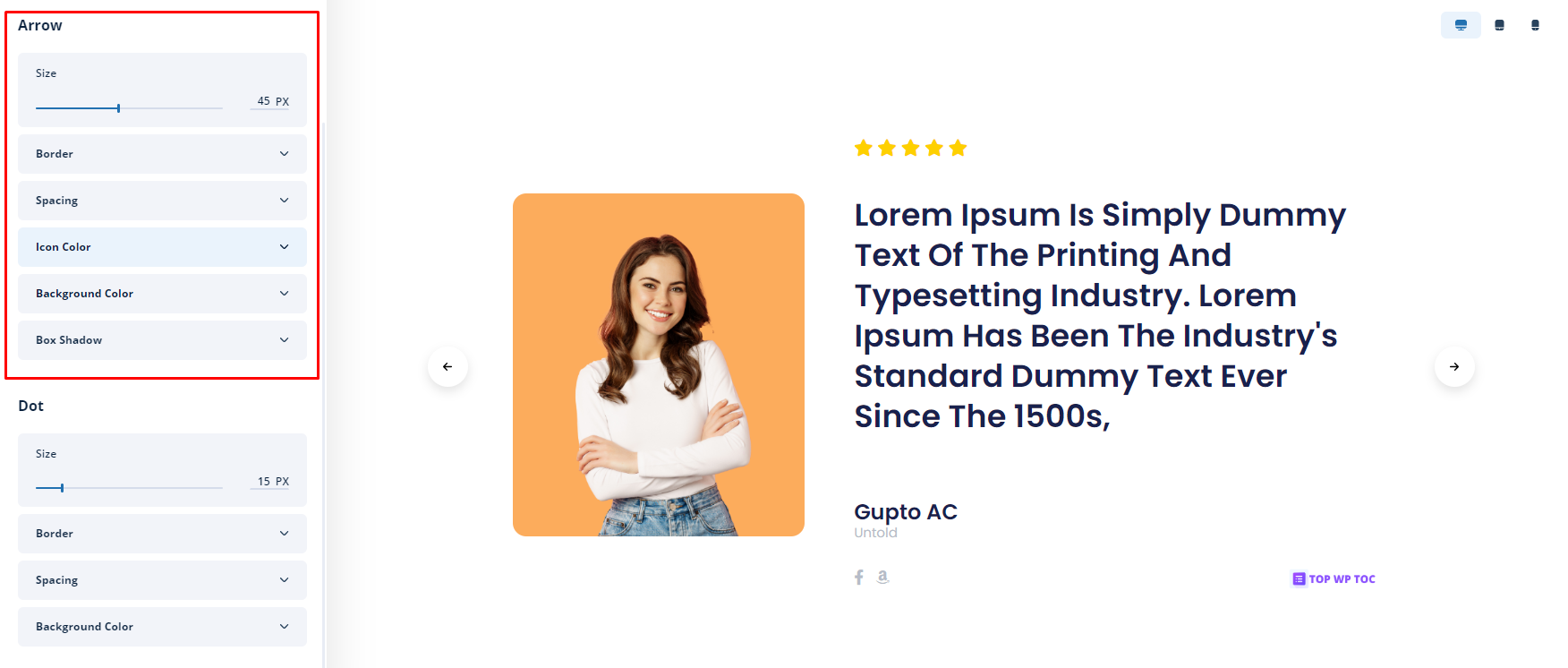
The following section contains settings related to arrows. Whether you want like, to adjust the size, set a background shadow, change the color of the arrow, or change the spacing, you can do it right here.
Size
The arrow size can be adjusted
Border
Adds a border to arrows
Spacing
Define the spacing arrow if necessary
Icon Color
Colors for the background and hover can be customized for the icon
Background Color
The background color of the arrow can be customized
Box Shadow
Creates a shadow for the Arrow
Dot
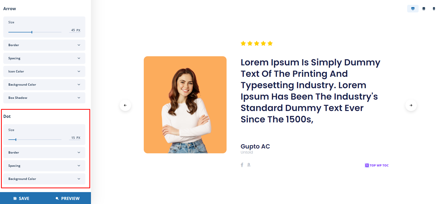
It is also possible to modify the dots at the bottom of the testimonials through the dot section. Besides changing the size, colorizing the dot, and setting a border, you can also adjust the spacing here.
Size
Dot size can be adjusted
Border
Adds a border to Dot
Spacing
In case of need, define the Dot spacing
Background Color
Customize Dot’s background color
