


- 1. Key Takeaways
- 2. What Is SaaS UI UX Design?
- 3. Why SaaS UI UX Design Decides Retention and Revenue
- 4. Eight Core Principles of SaaS UI UX Design
- 1. Design for Time-to-Value First
- 2. Reveal Complexity Gradually
- 3. Use Familiar Patterns Over Clever Ones
- 4. Match Information Density to Usage Frequency
- 5. Build Role-Based Views From Day One
- 6. Keep It Consistent With a Design System
- 7. Treat Accessibility as a Sales Requirement
- 8. Give Feedback on Every Action
- 5. SaaS UX Patterns, Screen by Screen
- 6. The Subscription Lifecycle UX Most Guides Skip
- 7. The SaaS UI UX Design Process in Six Steps
- 8. How to Measure Whether Your SaaS UX Is Working
- 9. Common SaaS UI UX Design Mistakes
- 10. SaaS UI UX Examples Worth Studying
- 11. How Boomdevs Fixes SaaS Products Users Abandon
- 12. Frequently Asked Questions
Summarize with
Your trial signups look healthy. Then you check who came back on day three. Most of them didn’t, and nobody filed a single complaint.
That silence usually points to design, not to missing features. Every confusing screen costs you a subscriber you already paid to acquire.
Good SaaS UI UX design fixes that. Here’s what it covers: the patterns that keep users paying, and how to measure whether yours is working.
Key Takeaways
- SaaS UI UX design shapes how people sign up, reach first value, and keep coming back. In a subscription business, every session is a quiet renewal vote.
- The average B2B SaaS activation rate is 37.5%, so most new users never reach the moment your product proves itself.
- The SaaS UX best practices that matter most are fast time-to-value, progressive disclosure, familiar patterns, role-based views, and a shared design system.
- Trial-to-paid, upgrades, downgrades, and cancellation are design surfaces too, and most guides skip them.
- Judge your UX by activation, feature adoption, time-to-value, and cohort retention, not by how the screens look in a review.
What Is SaaS UI UX Design?
SaaS UI UX design is the work of shaping how people sign up for, learn, and use subscription software, day after day. The UI is what they see and click. The UX is whether the whole path, from first login to the tenth renewal, makes sense to them.
The subscription model changes the brief. A one-time purchase only has to win the sale once. Your product has to win again every billing cycle, so every confusing screen doubles as a churn risk.
UI vs UX Inside a SaaS Product
In a SaaS product, UI covers the buttons, tables, charts, and type on each screen. SaaS UX design covers the user flows that connect those screens, like how a new admin invites a team or how a finance lead finds last month’s report.
You need both, and they fail in different ways. A polished UI can’t rescue a flow that hides the one action users came for. Our guide to the difference between UI and UX design goes deeper if you’re scoping which one your product needs.
How SaaS UX Differs From Website and One-Time Software UX
The quickest way to see the difference is to compare what each product type asks of its users:
| How often it’s used | Daily or weekly | Once or a few times | Occasionally |
| Main design goal | Task speed and retention | Clarity and conversion | Task completion |
| Onboarding need | High and ongoing | Little to none | Moderate, upfront |
| Users per account | Several roles | Anonymous visitors | One owner |
So SaaS UX design is built for repeat use by several kinds of people at once.. Patterns borrowed from marketing sites, like oversized hero sections and long scrolling pages, usually work against that.
Why SaaS UI UX Design Decides Retention and Revenue
In SaaS, design decides whether a signup becomes a customer. If users can’t reach value quickly, they leave before your pricing, support, or roadmap ever gets a chance.
The gap is bigger than most founders expect. Across 62 B2B companies in Userpilot’s SaaS Product Metrics Benchmark Report, the average activation rate was 37.5%. Roughly six in ten new users never hit the moment where the product earns its place.
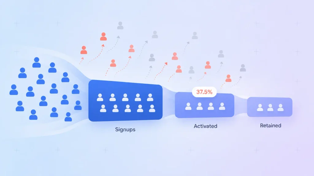
Activated users don’t explore much either. Userpilot’s benchmark data puts core feature adoption at 24.5%, which means most of what you built goes untouched.
Better SaaS UI UX design moves several business numbers at once:
- Activation: clearer first-run flows get more signups to a first real result.
- Retention: when routine tasks are quick, users have fewer reasons to shop around.
- Support load: every screen that explains itself is one less ticket.
- Expansion: when users can find advanced features, upgrading feels like a natural next step rather than a sales pitch.
That’s why UI/UX design for SaaS products is worth planning around retention metrics from the start. How the screens look in a review meeting is the least important test.
Eight Core Principles of SaaS UI UX Design
These eight principles separate the SaaS products people keep paying for from the ones they quietly drop. Each is a decision you can make on purpose, early, before it hardens into design debt.
1. Design for Time-to-Value First
Time-to-value is how long a new user takes to get their first real result. Shorten it, and almost every other metric improves. That’s why it leads most lists of SaaS UX best practices.
Start by naming the one outcome a new user cares about. For a scheduling tool, that’s a booked meeting. For an analytics tool, it’s a first chart built from their own data.
Then count the clicks from “Create account” to that outcome. If you can’t explain why each step exists, the path is too long.
2. Reveal Complexity Gradually
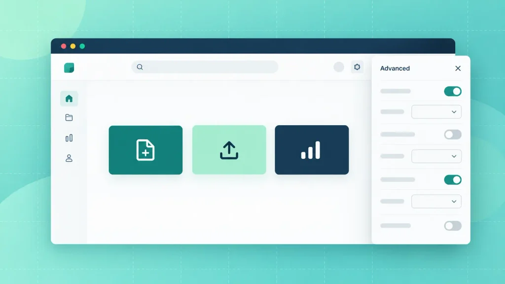
Progressive disclosure means showing core actions first and keeping advanced options one level down. Nielsen Norman Group’s guidance on progressive disclosure frames it as moving rarely used features to a secondary screen, so the product is easier to learn and less error-prone.
Here’s how that usually plays out in a SaaS interface:
- The few actions people use most sit on the main screen.
- Rare settings live in an “Advanced” panel or a secondary menu.
- Features unlock as users finish earlier steps, so nothing shows up before it’s useful.
The trade-off is discoverability. Hide too much, and power users assume a feature doesn’t exist, so pair this with a fast search.
3. Use Familiar Patterns Over Clever Ones
Your users bring habits from every other tool they use. A sidebar on the left, search at the top, and a settings gear in the corner all work because people already expect them there.
In SaaS UI design, novel layouts feel fresh in a design review and tiring in daily use. Instagram found this out in 2018, when a test of a horizontally scrolling feed sparked instant backlash and was quickly dropped.
Save your originality for the parts that are yours alone: the core workflow, the data view, the moment of value.
4. Match Information Density to Usage Frequency
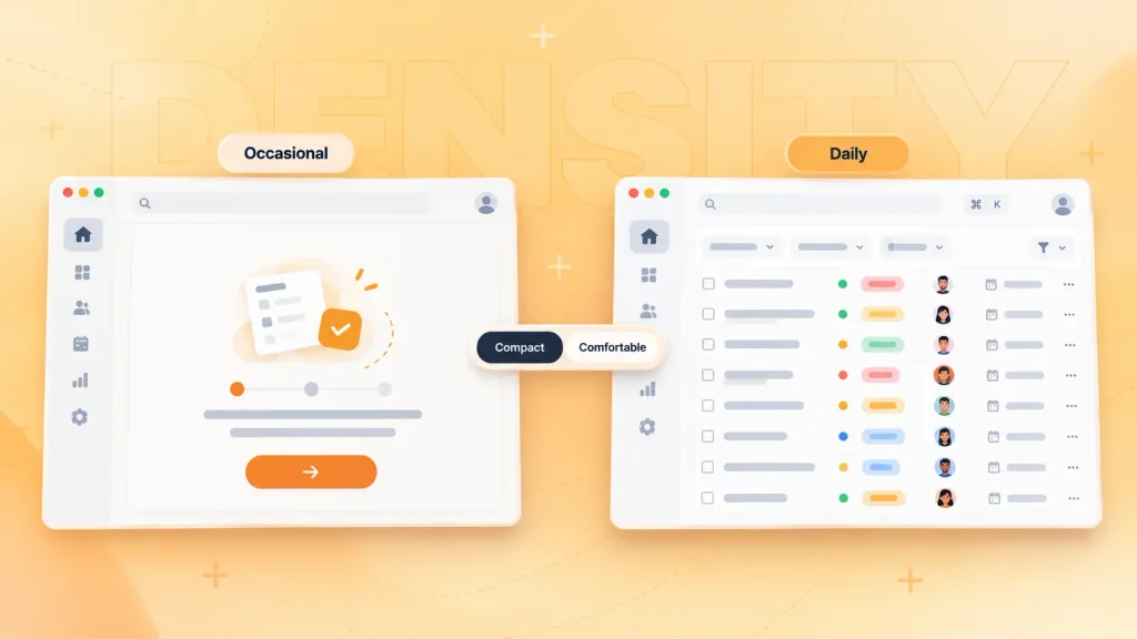
Minimalism isn’t always the right call in SaaS UI design. A tool someone opens once a month should be sparse and guided. A tool someone lives in for six hours a day can, and often should, show far more at once.
Linear is the usual example. Its issue lists pack status, priority, and assignee into tight rows, because engineers scan hundreds of issues a day. Spacing that out into roomy cards would slow them down.
A simple way to decide:
- Occasional use: fewer elements, more guidance, bigger click targets.
- Daily use: denser tables, keyboard shortcuts, saved views.
- Mixed audiences: a compact or comfortable toggle, so each person chooses.
Density only works with strong hierarchy, though. If everything is bold, nothing stands out.
5. Build Role-Based Views From Day One
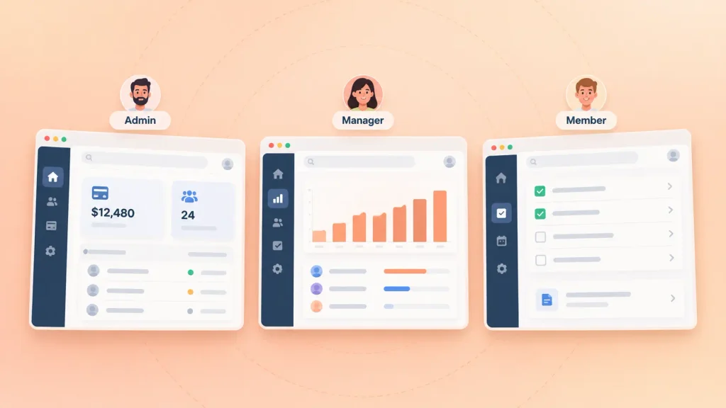
Most SaaS accounts hold several kinds of users. An admin manages billing and seats. A manager reviews reports. A team member just wants their task list.
If all three land on the same dashboard, two of them are looking at a screen built for someone else. Role-based access and role-based home screens fix that by changing defaults, navigation, and permissions per role.
Planning roles in your first wireframes is far cheaper than retrofitting them. Retrofitting usually means reworking navigation, permissions, and onboarding all at once.
6. Keep It Consistent With a Design System
A design system is your shared library of components, colors, type, spacing, and usage rules. In SaaS UI design, it’s what keeps your fortieth feature looking like it belongs next to your first.
Without one, every new feature invents its own buttons and modals. Users sense that drift before your team does, and it chips away at trust. A system also speeds you up, because designers and developers stop rebuilding the same table again and again.
7. Treat Accessibility as a Sales Requirement
Accessibility is now a buying criterion, not an extra. Since 28 June 2025, the EU Accessibility Act has applied to e-commerce services provided to EU consumers, and that can include the online sign-up and checkout flows of SaaS products sold to them. Legal guidance on the Act points to WCAG 2.2 as the practical standard for web platforms.
The baseline you’ll want in your first release:
- Keyboard navigation for every action.
- Color contrast that passes WCAG, plus text that resizes cleanly.
- Labels that screen readers announce correctly.
- Visible focus states, so users always know where they are.
Building this in from day one is cheap. Retrofitting it after a failed procurement review is not.
8. Give Feedback on Every Action
In good SaaS UX design, every click produces a visible response.
That might be a saved state, a loading indicator, or an inline error that says what went wrong and how to fix it.
Silence is the worst outcome. When someone clicks “Export” and nothing seems to happen, they click again, and now you have two exports and a confused customer. Small micro-interactions, like a checkmark after saving, prevent that.
SaaS UX Patterns, Screen by Screen
SaaS UX best practices only help when they show up on real screens. Here’s where the main SaaS screens usually break:
| Signup | Get in fast | Too many fields before value |
| First run | See what the product does | Blank screen, no next step |
| Dashboard | Spot what needs attention | Every metric shown at once |
| Settings and team | Invite people, manage access | Permissions buried or unclear |
| AI features | Get help, keep control | Answers with no visible reasoning |
Most products fail on one or two of these, not all five. The sections below cover what good looks like on each.
Signup and Onboarding
Good SaaS onboarding UX starts with a signup that asks for almost nothing. An email or single sign-on with Google or Microsoft, then straight into the product.
Profile questions can wait, or you can ask one or two that personalize the first screen. Mouseflow highlights how email platform Kit asks new users which tool they’re switching from, then adjusts its onboarding to match.
After signup, a short checklist of setup tasks gives people a visible path. Keep it skippable. Forced tours mostly teach users to click “Next” without reading.
Empty States
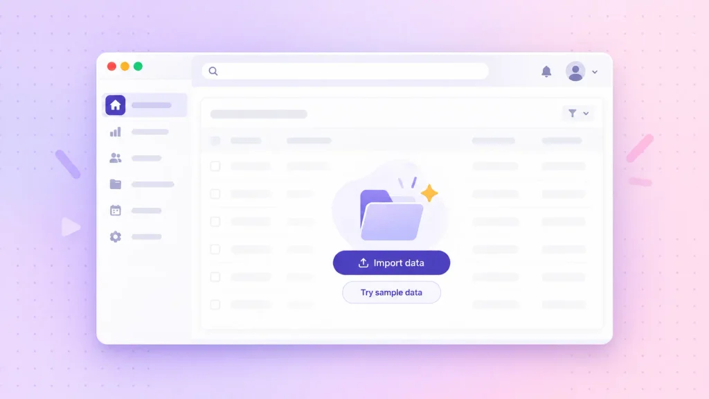
An empty state is what a screen shows before the user has any data. It’s the first thing most new users see, and one of the most neglected screens in most products.
A blank table that says “No records found” tells the user nothing. A good empty state does three jobs:
- It explains what will appear here once there’s data.
- It offers one clear action to create or import the first item.
- It can load sample data, so users explore before committing their own.
Treat every empty state as part of your SaaS onboarding UX, because for a new user, that’s exactly what it is.
Dashboards
Good dashboard design answers one question: what needs my attention right now? A dashboard that tries to show everything ends up answering nothing.
Lead with the three to five metrics that drive action for that role, and push the rest into reports. Use color only for meaning, like red for a missed target, so the eye lands where it should.
Our guide to web app design best practices covers layout and visual hierarchy in more detail. If you’d rather hand the whole screen set to a team, web app design at Boomdevs starts from exactly these user jobs.
Settings, Permissions, and Team Management
Settings are where B2B SaaS quietly loses deals. An admin trying to invite 20 people, assign roles, and connect single sign-on will judge your entire product by how painful that is.
Group settings by who uses them: personal, workspace, billing, and security. Then describe each role’s permissions in plain language (“Can edit projects, can’t see billing”) instead of a wall of checkboxes.
In-App AI Features
In SaaS UX design, AI features need more care, not less. Users want the help, but they also want to know where an answer came from and how to undo it.
A few patterns hold up well:
- Show what the AI used to produce its answer, such as source documents or data.
- Make every suggestion easy to accept, edit, or dismiss.
- Keep a clear undo for anything the AI changes on its own.
If AI sits at the core of your product rather than on top of it, our breakdown of AI SaaS development decisions covers the build side.
The Subscription Lifecycle UX Most Guides Skip
SaaS UX design doesn’t stop at the dashboard. Trial-to-paid, upgrades, downgrades, and cancellation are design surfaces too. They’re also where most SaaS products feel the least designed.
The Trial-to-Paid Moment
The end of a trial is a decision point, and your UI should make that decision easy. Users should always know how many days are left, what they’d lose, and what the paid plan costs.
Timing matters more than copy. Prompt the upgrade right after someone gets value, such as finishing their first report, not with a random day-seven popup. A prompt tied to success reads as an offer. A prompt tied to a timer reads as pressure.
Pricing Pages and In-App Upgrade Prompts
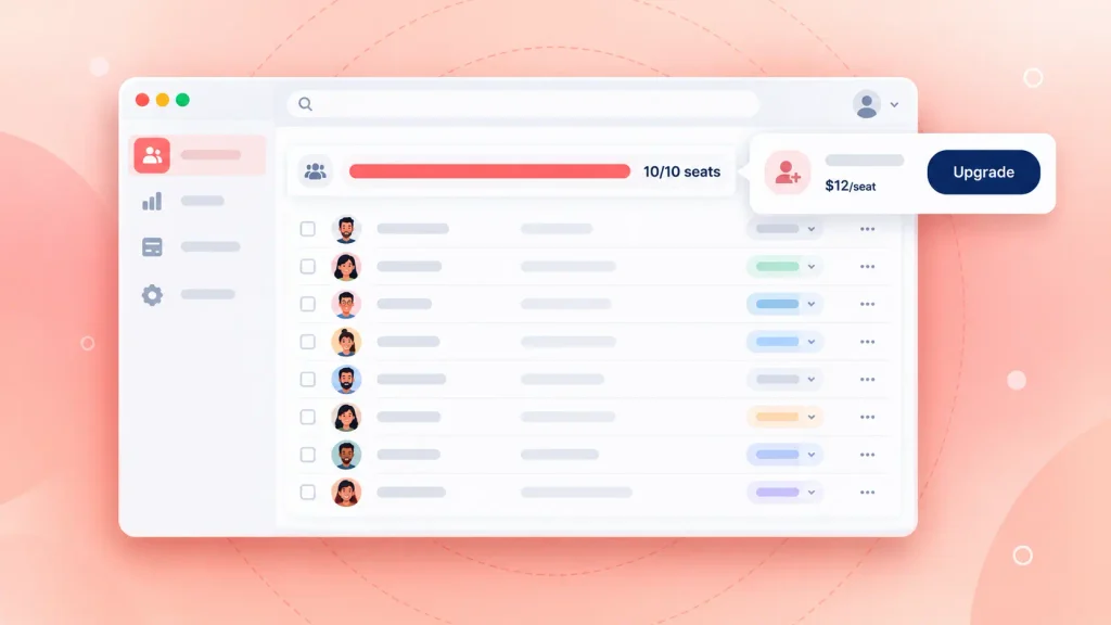
Your pricing page is product UX, not just marketing. Fuselab’s 2026 guide points out that Stripe, Linear, and Vercel treat pricing as a core product surface, with plan comparison and self-serve checkout in a single flow.
Inside the product, upgrade prompts work best at the limit itself. Someone who hits a seat cap should see the upgrade option right there, with the price. A dead end that sends them hunting through billing settings is a lost upgrade.
Downgrade, Billing, and Cancellation Flows
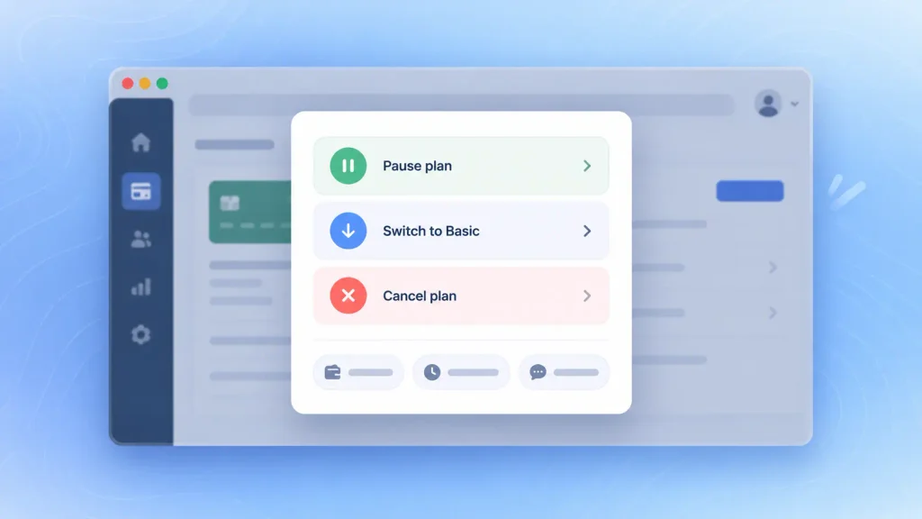
Hard-to-cancel flows might save a few accounts this month. They also breed angry reviews and customers who never come back. A respectful exit is part of your retention strategy, not a leak in it.
A good offboarding flow usually includes:
- A clear path: “Cancel plan” lives in billing settings, not behind a support ticket.
- A softer option: a cheaper plan or a pause, offered before full cancellation.
- One short question: why they’re leaving, with a few preset reasons.
- A clean confirmation: what happens to their data and exactly when access ends.
Those exit answers are some of the most honest UX research you’ll ever collect. I’d suggest reviewing them every month alongside your roadmap.
The SaaS UI UX Design Process in Six Steps
A solid SaaS UI UX design process gets from research to a tested prototype before any production code exists. That order matters. Fixing a flow in Figma takes hours, while fixing it after launch takes sprints.
Most projects move through these six steps:
- Research: interview users, review analytics, and map the job each role is trying to do.
- Information architecture: decide what lives where and how each role navigates.
- User flows and wireframes: sketch the critical paths, starting with signup to first value.
- Prototyping and usability testing: put a clickable prototype in front of a handful of real users.
- Visual design and design system: apply the brand and build reusable components.
- Handoff and iteration: deliver annotated files, then refine based on live data.
Each step gets a full breakdown in our UI/UX design process for startups. For how design fits alongside architecture, backend, and launch, you can read the SaaS development process.
How to Measure Whether Your SaaS UX Is Working
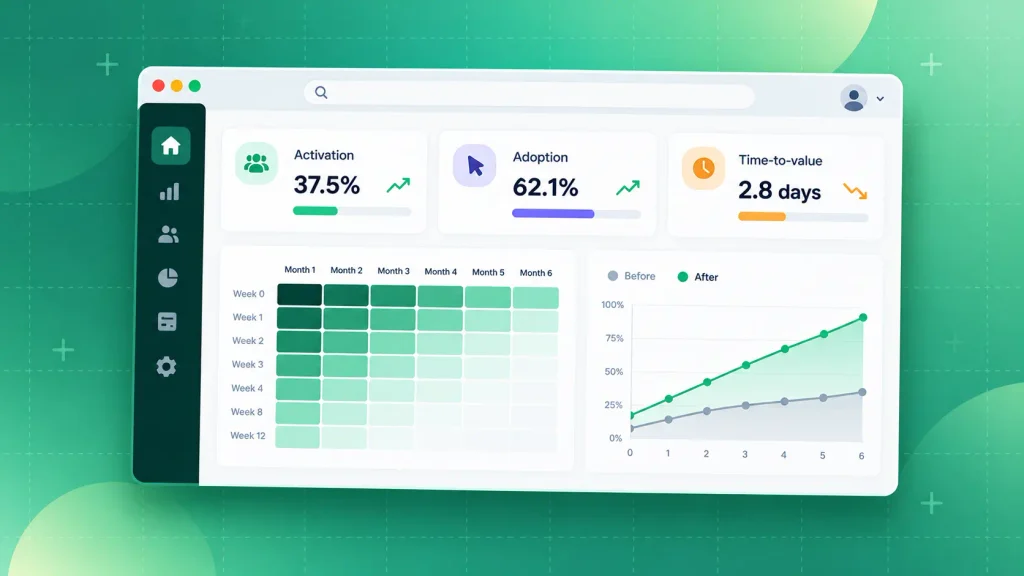
You can’t judge SaaS UX by how it looks. You judge it by what users do, and a short set of product metrics tells you most of what you need:
| Activation rate | Share of signups reaching first value | 37.5% average (Userpilot, 62 B2B firms) |
| Core feature adoption | Share of users on key features | 24.5% (Userpilot) |
| Time-to-value | How fast new users get a result | Your own trend over time |
| Task success rate | Whether users finish tasks unaided | Measured in usability tests |
| Cohort retention | Whether users keep coming back | Before vs after each change |
Only the first two have outside benchmarks you can lean on. The rest are most useful against your own baseline, measured before and after every design change.
One caution before you start tracking. Define “activation” for your product first, as the earliest action that predicts a user will stick, like sending a first invoice. Pick it from your own data, not from a competitor’s blog.
Common SaaS UI UX Design Mistakes
Most weak SaaS UX traces back to the same short list of mistakes. If your activation or retention numbers disappoint, these are worth checking first:
- Designing from assumptions: skipping research and building for an imagined user.
- One dashboard for every role: forcing admins, managers, and contributors onto the same screen.
- Front-loading every feature: showing the whole product on day one instead of in stages.
- Ignoring empty states: leaving new users in front of blank tables with no next step.
- Inconsistent components: three button styles and two kinds of modal across one app.
- Hiding the exit: making cancellation so hard that leaving customers turn into loud critics.
- Measuring opinions: judging designs by stakeholder taste instead of activation and retention.
If you spot three or more of these in your own product, a focused audit is usually faster than a full redesign. A UI/UX consulting review gives you a prioritized list of what to fix first.
SaaS UI UX Examples Worth Studying
Looking closely at a few well-known products is a cheap way to sharpen your own decisions. Here’s what each one teaches:
| Notion | AI suggestions inside the document | Add AI to existing workflows |
| Linear | Dense, keyboard-first issue lists | Daily-use tools can show more |
| Figma | Collaboration built into the core | Design the multi-user case first |
| Dropbox | Short, two-field signup | Ask for less before value |
| Slack | Message-first layout now crowded by workflows | Choose your primary activity carefully |
None of these lessons is about color or style. Each one is a structural choice made early, which is exactly why it’s so hard to copy late.
How Boomdevs Fixes SaaS Products Users Abandon
Boomdevs designs SaaS products around the numbers that decide renewal: activation, task success, and retention. Every engagement starts with research into your real users, then moves to tested prototypes before development begins.
You get research, user flows, visual design, and a design system from one team, with developers involved the whole way. After 3.5K+ projects across 10+ years, the team has seen most of the ways SaaS onboarding and dashboards go wrong.
Building something new? Design can run alongside SaaS product development, so nothing gets lost between Figma and code. Already watching users drop off? Starting with a review of your most important flows is usually the fastest win.
Want to know exactly where your users drop off? Book a free strategy call with Boomdevs and walk away with a clear list of what to fix first.
Frequently Asked Questions
What Is SaaS UI UX Design?
It’s the design of how people sign up for, learn, and use subscription software over time. UI covers the screens and components, and UX covers the flows between them. Retention is the main measure of whether it’s working.
How Is SaaS UX Different From Website UX?
A website usually serves a single visit with one goal, like a signup or a purchase. A SaaS product serves repeat, daily use by several roles inside one account. That shifts the focus from first impressions to task speed, onboarding, and long-term retention.
How Much Does SaaS UI UX Design Cost?
It depends on scope, the number of user roles, and whether you need a full design system. Our UI/UX design cost guide notes that most projects land between $10,000 and $49,999, based on Clutch’s verified review data. Complex, multi-role platforms can run higher.
How Long Does a SaaS UI UX Design Project Take?
A focused MVP design engagement at Boomdevs typically runs four to eight weeks. Larger products with several user roles, complex flows, and a full design system take longer. Research and testing time is the part worth protecting, since it prevents expensive rework later.
What Makes a Good SaaS Dashboard?
A good SaaS dashboard shows each role the few metrics that need action right now. It uses color only to signal meaning, keeps details one click away, and lets users adjust what they see. If a dashboard needs a tutorial, it’s showing too much.