


- 1. Key Takeaways
- 2. The UI/UX Design Process for Startups: 7 Steps
- 3. UX vs UI: Who Does What in the Process
- 4. Design Thinking, Double Diamond, and Lean UX: Which Model Fits You
- 5. What You Should Receive at Each Stage
- 6. How to Run a Lean UI/UX Process for an MVP
- 7. Red Flags in a Design Partner's Process
- 8. How Boomdevs Solves the Design-to-Build Gap
- 9. Frequently Asked Questions
- 10. Ready to Scope Your Design Process?
Summarize with
You approved the screens last month. They looked sharp in Figma, and everyone loved them.
Then five real users tried your app. Three of them couldn’t find the signup button. Now you’re paying for a redesign before launch.
That gap between pretty and usable is what a proper UI/UX design process for startups closes. Here’s how the seven steps work, what you should get from each one, and where you can safely move faster.
Key Takeaways
- Seven steps, in order: discovery, user research, information architecture, wireframes and visual design, prototyping, usability testing, and developer handoff.
- UX before UI: structure and flows get settled before anyone debates colors. Flip that order, and you get beautiful screens that don’t work.
- Small tests catch most problems: Nielsen Norman Group’s research shows a handful of users expose most usability issues in a prototype, long before code is written.
- Timelines vary: UXPin puts a simple feature redesign at two to four weeks and a full product at three to six months.
- MVPs can go lighter, not shorter on steps: compress research and polish, but never skip testing or handoff.
The UI/UX Design Process for Startups: 7 Steps
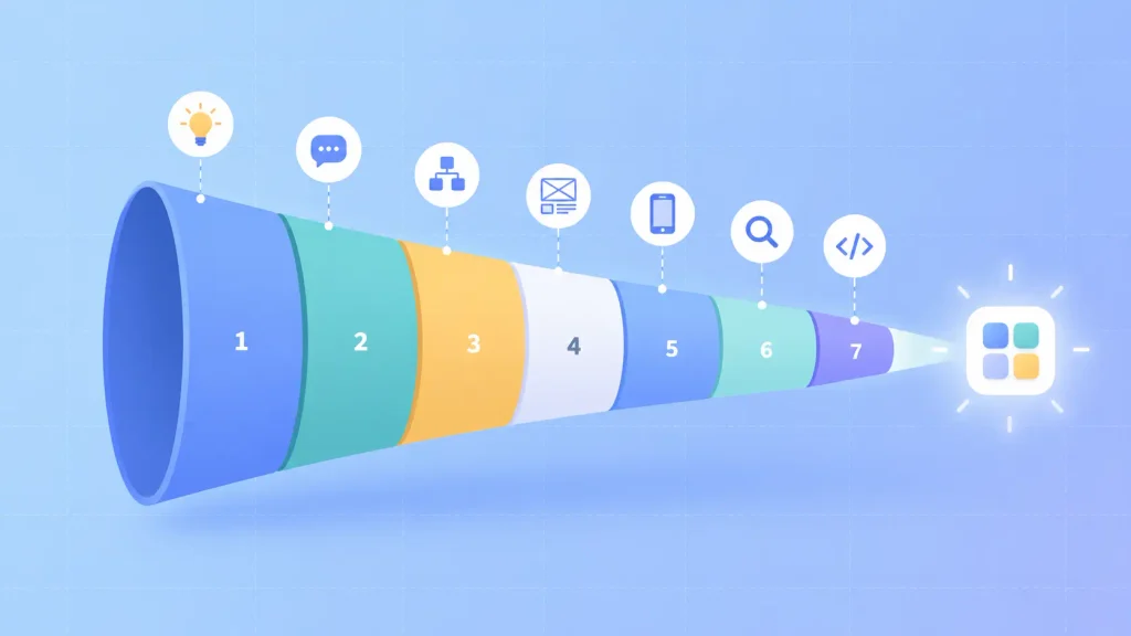
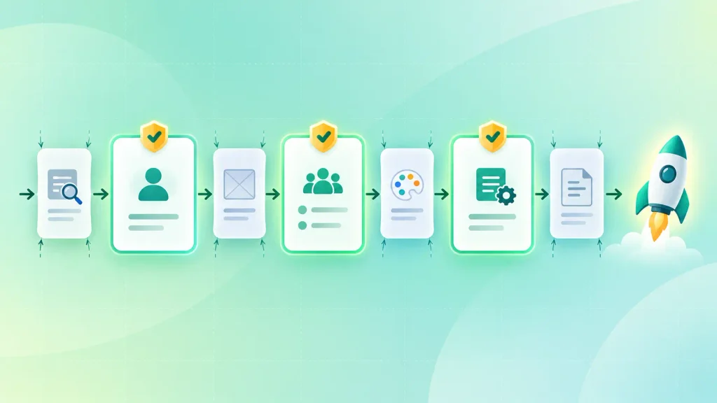
Think of the process as a funnel of decisions. Each step narrows what you’re building, so the next step is cheaper to change.
Most experienced product teams work through it in this order:
- Discovery and goals: agree on the problem, the user, and what success looks like.
- User research: replace guesses with what users actually do.
- Information architecture and user flows: decide where things live and how people move.
- Wireframes and visual design: build the structure, then the look.
- Interactive prototyping: make it clickable before it’s coded.
- Usability testing and iteration: watch real people use it, then fix what breaks.
- Developer handoff and post-launch: turn design intent into build instructions.
The names change between agencies. The order shouldn’t. Here’s what happens inside each step.
Step 1: Discovery and Goals
Discovery is where the UI/UX design process for startups begins: you and your design team agree on what you’re solving, for whom, and how you’ll know it worked. It usually takes a workshop or two, not weeks.
You’ll want to leave with three things written down:
- A problem statement: one or two sentences a new hire could repeat back.
- Success metrics: signup completion, time to first value, or support tickets. Pick whatever ties design to revenue.
- Constraints: budget, launch date, tech stack, and compliance rules. Fintech and healthcare products have plenty.
If the product idea itself is still fuzzy, a short product consultation can do this groundwork before any design starts.
Step 2: User Research
User research swaps your team’s assumptions for evidence. In a UI/UX design process for startups, that rarely means a big formal study.
A few honest conversations and a look at your data often settle debates that would otherwise run for weeks. The common methods:
- User interviews: short talks about how people solve the problem today.
- Analytics and session recordings: where people drop off in your current funnel.
- Competitor review: what users already use, and where it frustrates them.
- Surveys: good for sizing a pattern you’ve already heard in interviews.
Research usually produces user personas and a journey map. Useful, but the output that really matters is a short, ranked list of user needs. If nobody opens it again in week six, it didn’t do its job.
Step 3: Information Architecture and User Flows
Information architecture decides where everything lives in your product. Think of it as the floor plan before the furniture arrives.
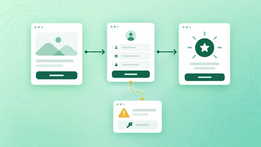
User flows sit on top of it. They map the exact path someone takes to finish a task. I’d suggest mapping these first:
- Onboarding, from the landing page to the first “aha” moment
- The core task your product exists for
- Upgrade or checkout
- Recovery paths: password reset, error messages, and empty states
Most teams map the happy path and forget recovery. That’s exactly where your future support tickets come from. Card sorting, where users group menu labels themselves, is a cheap way to check that your navigation makes sense.
Step 4: Wireframes and Visual Design
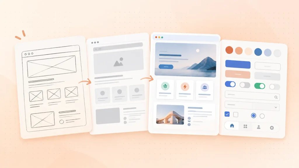
Wireframes are grayscale layouts that show structure without the distraction of color. Visual design comes after, once that structure holds up.
The trick for you as a founder is giving the right feedback at the right fidelity:
| Fidelity | What it shows | What to review |
| Sketches | Rough options | Is this the right idea? |
| Wireframes | Layout and hierarchy | Can users find things? |
| High-fidelity mockups | Final look, real copy | Brand, readability, contrast |
| Design system | Reusable components | Consistency across screens |
Debating button colors on a wireframe wastes a whole round. For deeper guidance on the visual layer, see these web app design best practices or the basics of mobile app design.
AI tools now sit inside this step. Tools like Figma AI and Uizard can turn a prompt or sketch into a first-draft layout in minutes. They’re fast at drafts and weak at judgment, so treat their output as a starting point, not a decision.
Step 5: Interactive Prototyping
An interactive prototype is a clickable version of your design that behaves like the real product, with no code behind it. It’s where you find out whether a flow works before paying engineers to build it.
A good prototype covers the core flows from Step 3, including at least one error state. Figma and Framer are the usual tools. If someone can tap through signup and your core task without asking “what now?”, you’re ready to test.
Step 6: Usability Testing and Iteration
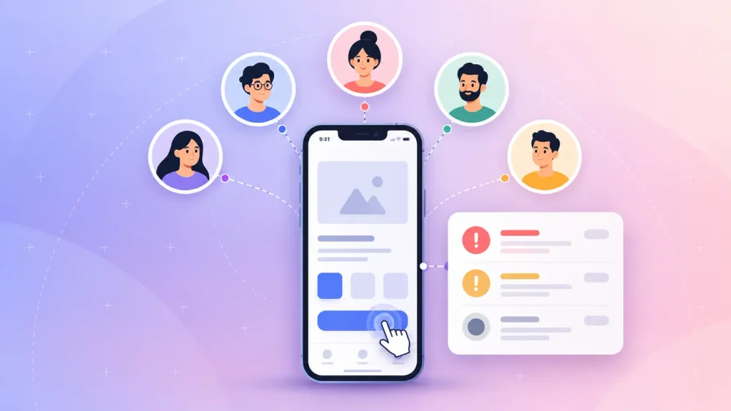
Usability testing is the step that saves the most money in the UI/UX design process for startups. It means watching real people try to complete tasks in your prototype, and noting where they hesitate. You don’t need a big sample to learn a lot.
Nielsen Norman Group recommends testing with around five users per round and running several small rounds instead of one big one. You can pick from a few formats:
- Moderated sessions: a facilitator watches users complete tasks live and asks follow-up questions.
- Unmoderated remote tests: users work alone through tasks in tools like Maze or Lyssna.
- First-click and preference tests: quick checks on a single screen or choice.
- A/B tests: two variants compared with real traffic, usually after launch.
Once you have findings, rank them by severity. Blockers first, friction second, polish last. Then fix and test again.
Step 7: Developer Handoff and Post-Launch
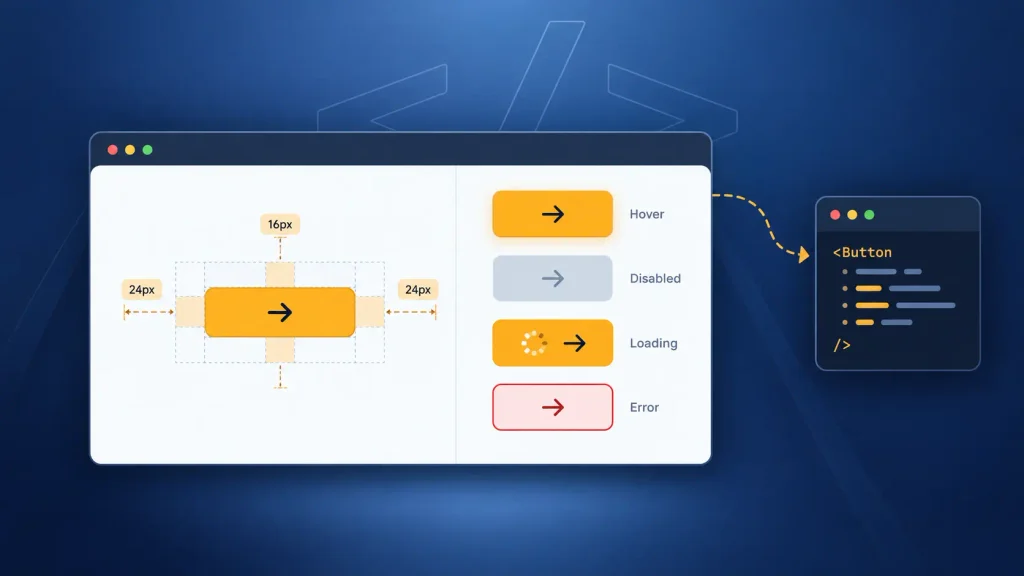
Handoff is where design intent turns into build instructions. Done badly, it’s where good designs quietly fall apart.
A build-ready handoff should include:
- Specs: spacing, typography, and color tokens, usually inspected through Figma Dev Mode or Zeplin.
- Every component state: hover, disabled, loading, and error.
- Edge cases: empty screens, long names, slow connections.
- An annotated prototype: notes explaining how key interactions behave.
After launch, the loop restarts. Analytics show where people still struggle, and that feeds the next round of design. The engineering side of this hand-off is covered in our guide to the custom web app development process.
UX vs UI: Who Does What in the Process
UX decides how your product works. UI decides how it looks and feels while it works.
In practice, UX leads the early and testing steps, and the UI design process takes over once the structure is settled:
| Aspect | UX design | UI design |
| Core question | Does it work for users? | Does it look and feel right? |
| Main work | Research, flows, structure, testing | Layout, typography, color, components |
| Key outputs | Personas, user flows, wireframes | Mockups, design system, specs |
| Leads in | Steps 1 to 3, and 6 | Steps 4, 5, and 7 |
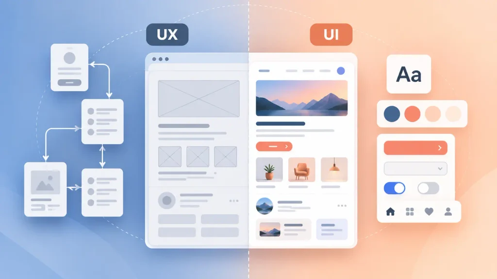
At a startup, one product designer often covers both roles. That’s fine, as long as they do the UX work first. If you’re still wondering which comes first, we broke down the reasoning in a separate guide. If you’re building a marketing site rather than a product, the custom web design process runs a little differently.
Design Thinking, Double Diamond, and Lean UX: Which Model Fits You
Each model, from the design thinking process to Lean UX, describes how you move through the seven steps. They don’t replace them.
As UXPin puts it, design thinking is the philosophy and the UX design process is the practice. Here’s how the common models compare:
| Model | How it works | Best for |
| Design thinking | Empathize, define, ideate, prototype, test | New ideas, fuzzy problems |
| Double Diamond | Diverge then converge, once on the problem and once on the solution | Teams that jump to solutions early |
| Lean UX | Short cycles built on testable assumptions | Early startups, shifting requirements |
| Agile UX | Design runs a sprint or two ahead of development | Products already in active build |
You don’t have to pick one forever. For an early-stage product, I’d suggest Lean UX’s short cycles while you’re still finding fit, then an Agile UX rhythm once engineering is shipping every sprint. UXfolio’s breakdown covers how each model maps onto the stages in more depth.
What You Should Receive at Each Stage
Every stage of the UI/UX design process for startups should end with something you can see and a decision you sign off on. If a stage ends with neither, you’re paying for activity, not progress.
Here’s what a well-run project hands you across the stages of UI/UX design:
| Stage | What you receive | What you approve |
| Discovery | Brief with goals and metrics | Scope and success criteria |
| User research | Research summary, personas | Ranked user needs |
| Information architecture | Sitemap, user flows | Navigation and core flows |
| Wireframes and visual design | Wireframes, mockups, design system | Layout first, then visual direction |
| Prototyping | Clickable prototype | Flows ready to test |
| Usability testing | Findings ranked by severity | Which fixes go in |
| Handoff | Annotated files, specs, assets | Build-ready design |
It’s worth asking for this table before you sign anything. A partner who can’t fill it in hasn’t really thought through their own process.
How to Run a Lean UI/UX Process for an MVP
You can run a lighter UI/UX design process for startups building an MVP by shrinking each step, not by deleting steps. The goal is to learn fast, not to ship a polished product nobody wants.
What You Can Compress
Most of the time savings come from doing less of each step, on fewer screens. A few places where you can cut safely:
- Research: a few interviews plus a competitor review, instead of a full study.
- Visual design: a proven UI kit or component library instead of a custom design system.
- Scope: design your one core flow in full, and leave secondary screens at wireframe level.
- Documentation: lean specs in Figma rather than long design documents.
None of these cuts touch the decisions that matter. They just delay the polish until you know what’s worth polishing.
What You Should Never Skip
Three steps protect you from the most expensive failure there is: building the wrong thing well.
- Problem definition. Without it, every later debate turns into opinion versus opinion.
- Usability testing on the core flow. Fixing a prototype costs hours. Fixing shipped code costs sprints.
- Handoff states. Missing error and empty states turn into developer guesswork, and guesswork ships.
The payoff for getting this right is measurable. McKinsey’s study of 300 public companies found that top-quartile design performers grew revenue 32 percentage points faster than their industry peers over five years.
Skipping these steps is also one of the patterns behind why mobile apps fail. If you’re scoping an MVP right now, Boomdevs’ SaaS MVP development team can help you decide which steps to compress for your timeline.
Red Flags in a Design Partner’s Process
The quickest way to judge a design partner is to ask them to walk you through their process on a past project. Vague answers now usually mean vague work later.
Watch for these warning signs:
- They open Figma before asking about your users. No discovery means the design is built on your assumptions.
- Usability testing isn’t in the plan. Then you’re the test, and so are your first paying customers.
- Revisions are “unlimited” but nothing gets signed off. Without decision gates, projects drift for months.
- They can’t show a real handoff file. Ask for annotated specs from a past project. If they can’t produce one, expect your developers to guess.
- Developers only join at the end. That’s when technical limits turn into expensive redesigns.
One or two of these on their own might be fixable in a conversation. Three or more, and it’s worth looking elsewhere. If you already have an in-house product team and just need designers who follow a real process, UI/UX staff augmentation can fill that gap without a full agency engagement.
How Boomdevs Solves the Design-to-Build Gap
Most design problems surface at handoff, when a separate development team inherits files they never helped shape. That’s where states go missing and good flows get rebuilt as something worse.
Boomdevs runs the UI/UX design process for startups and the engineering under one roof. The people building your product can review designs while they’re still cheap to change, and testing stays in the plan even on tight MVP timelines.
That approach comes from 10+ years and 3.5K+ delivered projects across fintech, healthcare, e-commerce, and SaaS.
Frequently Asked Questions
How long does the UI/UX design process for startups take?
It depends mostly on scope. A landing page can take days, while a full app or software product can run for months. According to the UX Design Institute, the biggest variables are project complexity, team size, and how many rounds of testing and iteration you run.
How many steps are in the UI/UX design process?
Most frameworks list five to eight UX design process steps. Design thinking uses five phases, while agency and education guides often split the work into seven or eight steps. The labels matter less than the order: understand first, design second, test before you build.
Does UX or UI come first?
UX comes first. Research, flows, and wireframes set the structure, and UI design builds the visual layer on top. Reversing the order tends to produce attractive screens that fail in testing.
Can AI replace parts of the UI/UX design process?
AI can speed up parts of it, like summarizing interview notes, drafting layouts, or writing placeholder copy. It can’t decide what your users need or judge whether a flow actually works. Testing with real people is still the step that tells you the truth.
What happens if you skip user research?
You design for your own assumptions, and you find out they were wrong after launch. Problems caught in a prototype are far easier and cheaper to fix than problems in shipped code. Even a few interviews are better than none.
Ready to Scope Your Design Process?
If you’re planning a new product or reworking one that isn’t converting, it helps to map the UI/UX design process for startups to your actual timeline and budget. You can book a free call with Boomdevs to walk through your scope and see which steps your product really needs.