

Worked with 350+
Startup Founders

Websites That Work Perfectly on Every Device Your Users Actually Use
Over 60% of web traffic comes from mobile. A website that breaks on smaller screens is not a minor inconvenience. It is a conversion problem, an SEO problem, and a brand credibility problem happening simultaneously. Boomdevs builds mobile-first websites that perform consistently across every device, browser, and screen size.























Why Most Websites Still Fail on Mobile
Having a website is not the same as having a website that works. These are the gaps costing businesses traffic, rankings, and revenue every day.


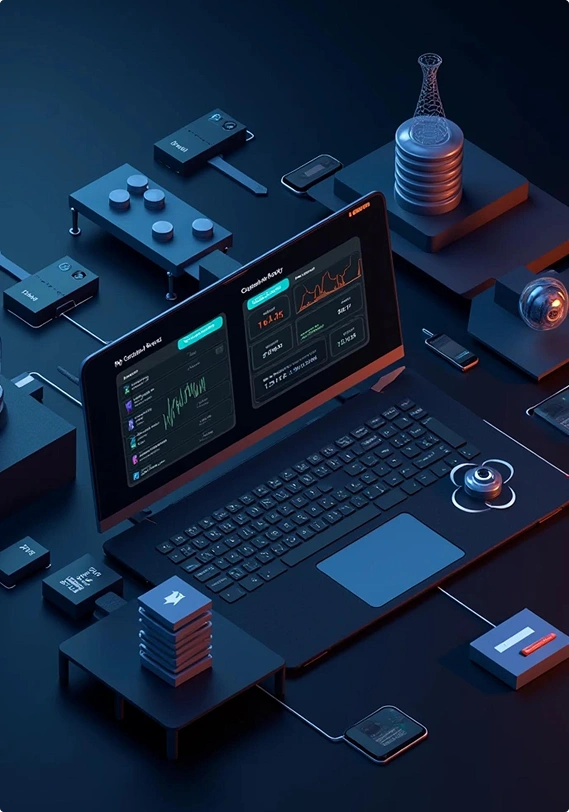
Desktop-First Builds That Break on Mobile
Websites designed for desktop and adapted for mobile as an afterthought produce broken layouts, unreadable text, and unusable navigation on the devices most users browse on.
Inconsistent Experience Across Browsers and Devices
A site that works on Chrome breaks on Safari. A layout that looks right on iPhone looks wrong on Android. Browser inconsistencies frustrate users and signal poor technical execution.
Slow Mobile Load Times Killing Conversions
Desktop performance optimized builds that ignore mobile network conditions load too slowly for users on cellular connections. Every extra second costs measurable conversion rate.
Google Penalizing Non-Responsive Sites
Google uses mobile-first indexing. Websites that perform poorly on mobile rank lower in search results regardless of how well they perform on desktop. Poor responsiveness is an SEO penalty.
Touch Interfaces Ignored in the Design
Hover states, small click targets, and mouse-dependent interactions do not translate to touch screens. Users on mobile struggle with interfaces designed exclusively for cursor-based navigation.
Responsive Added as a Fix, Not Built as a Foundation
Responsiveness retrofitted onto an existing desktop build creates inconsistencies, hacks, and maintenance problems that compound with every new page or feature added to the product.
How Boomdevs Builds Truly Responsive Web Products
Mobile-first from the first wireframe. Every breakpoint tested before delivery. Every interaction designed for touch, cursor, and keyboard simultaneously.


Responsive Web Products We Deliver Across Every Category
Every web product we build is responsive by default across every use case, industry, and platform requirement.

Corporate and Business Websites
Professional websites built to hold up under scrutiny on every device a prospect, partner, or investor uses to evaluate your business.

SaaS and Tech Marketing Sites
High-performance SaaS websites that communicate product value, convert trial signups, and load fast on the mobile devices most tech-savvy users browse on first.

E-Commerce and Retail Stores
Mobile-first shopping experiences where product browsing, cart management, and checkout work as well on a phone as they do on a desktop workstation.

B2B Lead Generation Sites
Buyer-journey focused websites that convert qualified traffic into pipeline on every device a decision-maker uses to research vendors during their evaluation process.

Startup and MVP Websites
Fast, credibility-building startup websites that communicate value clearly and capture leads effectively regardless of what device a potential customer or investor opens the link on.

Web Applications and Dashboards
Complex web application interfaces simplified for tablet and mobile without stripping out the functionality power users depend on for daily operational tasks.

Portfolio and Agency Websites
Work-showcase websites that display case studies, project visuals, and brand identity consistently and compellingly across every screen size a potential client views them on.

Landing Pages and Campaign Sites
Paid traffic landing pages optimized for the mobile devices most ad clicks arrive on, with fast load times and conversion paths that work for thumb navigation.





Industries We Serve
We provide tailored solutions for various industries, optimizing efficiency and driving innovation.


How We Build Your Responsive Web Product
From mobile-first structure to cross-device launch, every stage designed to produce a web product that performs consistently wherever your users access it.
Discover and Plan
We audit your target audience's device usage, define breakpoint strategy, and map content hierarchy for mobile before desktop. Technical requirements and performance benchmarks agreed at this stage.
Design and Prototype
Mobile-first wireframes and high-fidelity designs built across all major breakpoints. Interactive prototype tested on real devices before development begins to catch layout and interaction issues early.
Develop and Test
Front-end built with mobile-first CSS architecture, fluid layouts, and optimized assets throughout. Cross-browser and cross-device testing runs in parallel with development, not after the build is complete.
Launch and Optimize
Performance benchmarks verified across mobile and desktop before go-live. Post-launch monitoring covers Core Web Vitals, device-specific load times, and cross-browser rendering on an ongoing basis.Software We’ve Helped Launch
We build quietly behind the scenes, but our clients get the spotlight. We’ve worked with startups across industries. Here are a few real outcomes


Boomdevs delivered exactly what we needed right on time. The new booking system has made our day-to-day smoother, and their team was easy to work with the whole way through.


Working with Boomdevs was smooth from start to finish. The new site is beautiful and it’s much faster and easier for our team to manage. Most importantly, our customers are finding it easier to order and we’ve definitely seen the difference in sales and feedback since launch.


Boomdevs brought our vision for The Active Project to life. They truly understood what we were trying to build and made it better than we imagined. Our community finally has a space that feels like home.


Boomdevs delivered exactly what we needed and fast. They helped us automate our entire fulfillment workflow and made a really complex platform feel simple and solid. Couldn’t have launched without them.


Working with Boomdevs felt like having a true partner by our side. After a failed attempt with another agency, they really took the time to understand what we were trying to build and made it even better. They’re the kind of team you want in your corner.


Boomdevs really felt like an extension of our own team. They understood what we were trying to build, and just made it happen. We’ve worked with a lot of teams before, but this collaboration stood out. Super grateful for their work.


We launched our app without a single issue, and that’s a direct result of Boomdevs’ planning and execution. Everything was tested, smooth, and on point


Boomdevs adapted around our timelines and shifting priorities. They planned and tested everything right. It was refreshing not to have last-minute chaos.


Boomdevs was super flexible with our schedule. Things shifted a lot on our end, but they rolled with it. And they still delivered great work.


One of the nicest teams we’ve worked with. Friendly, clear, and really capable. They made even the tricky parts feel simple.


Their mix of tech knowledge and real industry insight helped a ton. It felt like they weren’t just building what we asked, but building what we actually needed.


The Boomdevs team was easy to talk to, super open, and always helpful. They made sure we understood what was happening and kept us looped in the whole time.


They honestly nailed it. The communication was smooth, the timelines were solid, and the end result was exactly what we were hoping for. No complaints at all.


What I appreciated most was how Boomdevs was always trying to improve things even beyond the scope. They didn’t just follow instructions; they actually cared about the outcome.


Boomdevs came in and built out key parts of our platform. It was a big job, but they handled it with care and consistency. Their work made it possible for us to scale up


Launching Grabbacoupon felt way less stressful thanks to Boomdevs. They handled the WordPress stuff like champs and helped us bring the whole thing together in a way that made sense.


Boomdevs helped us overhaul our WordPress site and provided ongoing support that actually made a difference. Site’s faster, easier to manage, and they’re always quick to jump in when needed


We’re super happy with our 5Aside website. It’s slick, works great, and Boomdevs didn’t make a big deal out of changes, they just made it better. Felt like they were really invested.


Hashtank was an NFT project, and Boomdevs took it seriously from day one. They didn’t just ‘build it’ they understood what we were going for. Their support honestly made the whole thing possible.

For Stadiuum, we wanted something fast and clean, a sports news platform that didn’t feel clunky. Boomdevs handled the full-stack side like pros. Great communication, great execution.


We needed a solid lead gen site built on WordPress and were on a tight timeline. Boomdevs absolutely delivered. Everything worked smoothly, and their team was super easy to work with. Straight to the point


Boomdevs really helped us get Junggl off the ground. We needed a clean, fast crypto news platform, and they just got it. The team was sharp, responsive, and felt more like collaborators than a dev agency. It was honestly a fun project.

Why Businesses Choose Boomdevs for Responsive Web Development
Mobile-first thinking, cross-browser precision, and performance standards that treat responsive development as a foundation, not a feature.
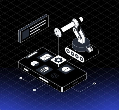
Mobile-First Is How We Build, Not What We Add
Responsiveness is an architectural decision made at the start of every project. We do not adapt desktop builds for mobile. We build for mobile and scale up to desktop.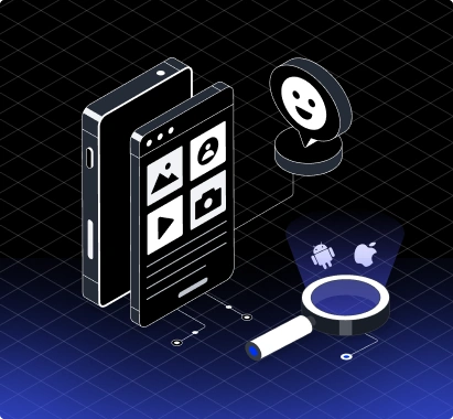
Real Device Testing Before Every Delivery
Every project is tested on physical iOS and Android devices before handover. Issues that simulators miss get caught on real hardware before your users encounter them.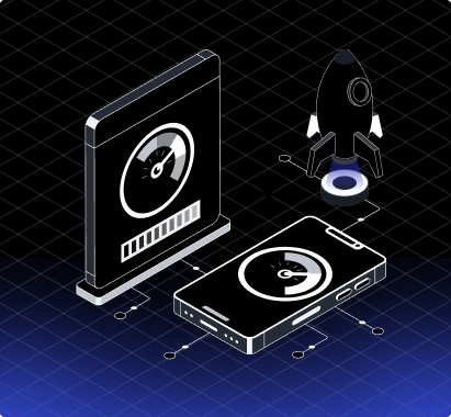
Performance Optimized for How Mobile Users Browse
Image delivery, load speed, and interaction performance optimized for cellular connections and mobile processors, not just broadband-connected desktop users on powerful machines.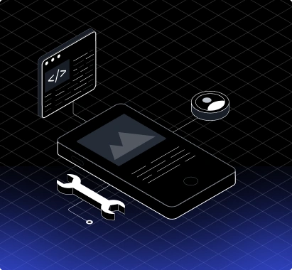
Cross-Browser Consistency Guaranteed
Chrome, Safari, Firefox, and Edge tested on both mobile and desktop operating systems throughout the build. Your site looks and works correctly everywhere it is accessed.
SEO Built Around Mobile-First Indexing
Google indexes the mobile version of your site first. Every responsive build we ship is structured, optimized, and tested specifically to perform well under mobile-first indexing conditions.
Security Is Part of the Build, Not the Bill
Our expert team configures SSL, input validation, and vulnerability monitoring on every build. Your site is secure from the first visit on every device.


Let’s Build Something
Exceptional
Have a project in mind? Let’s turn it into something amazing.

Mohammad Robin
Founder & CEOBook a FREE Strategy Call
Mohammad Robin
Founder & CEOBook a FREE Strategy Call
Frequently Asked Questions About Our Responsive Web Development Services
What is responsive web development?
Responsive web development is the practice of building websites and web applications that adapt their layout, content, and interactions to display correctly across every device, screen size, and browser without requiring separate mobile and desktop versions.
Why does responsive design matter for SEO?
Google uses mobile-first indexing, meaning it crawls and ranks the mobile version of your site primarily. Websites that perform poorly on mobile rank lower in search results regardless of how well the desktop version performs.
What is mobile-first development?
Mobile-first development means designing and building for the smallest screen size first and scaling up to larger screens. It produces cleaner code, better performance on mobile, and a more intentional experience across every device.
How is responsive development different from adaptive development?
Responsive design uses fluid layouts that scale continuously across any screen size. Adaptive design uses fixed layouts built for specific screen sizes that switch at defined breakpoints. Responsive is more flexible and easier to maintain as new devices emerge.
Do you test on real devices or just simulators?
Both. Simulator testing covers the majority of layout and functionality issues. Real device testing catches rendering inconsistencies, touch interaction problems, and performance issues that simulators miss.
Will a responsive website affect my page speed?
Done correctly, responsive development improves mobile page speed through adaptive image delivery, optimized CSS, and mobile-specific performance tuning. Done poorly, it adds overhead. Our builds are optimized for speed on every device.
Can you make our existing website responsive?
Yes. We audit your current website for responsiveness failures, mobile performance issues, and cross-browser inconsistencies then rebuild the front-end with mobile-first architecture without changing your existing content or CMS.
How many breakpoints do you build for?
We build for mobile, tablet, desktop, and large desktop as standard breakpoints and add custom breakpoints wherever your specific layout requires them. Fluid layouts reduce the need for numerous fixed breakpoints.
How long does a responsive web development project take?
A focused responsive website takes four to eight weeks. Larger web applications with complex interfaces, multiple user roles, and extensive cross-device testing take longer depending on scope and technical requirements.
Do you provide ongoing support after launch?
Yes. Post-launch support covers cross-browser and cross-device monitoring, performance optimization, OS update compatibility, and responsive layout fixes as new devices and browser versions are released.